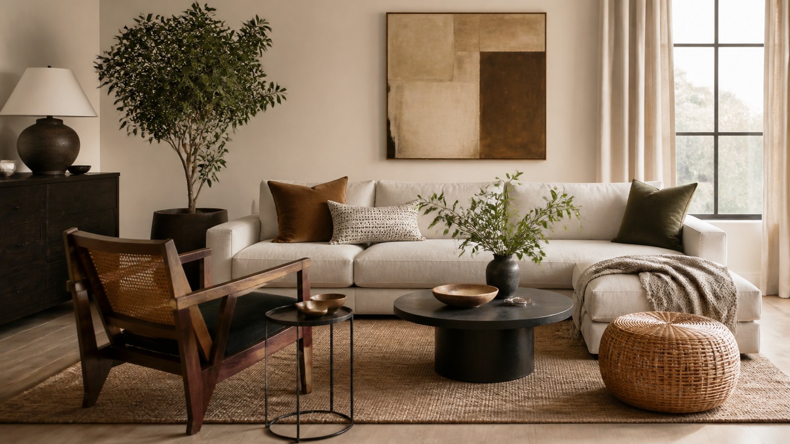
Paint can help a home feel cleaner, brighter, and easier to move into, but value-friendly color is not about chasing one magic shade. The goal is to reduce buyer objections, make fixed finishes look intentional, and help rooms photograph well without making the house feel bland.
The best resale colors usually sit in the soft neutral range: warm whites, light greiges, gentle taupes, muted grays, and quiet greens or blues used carefully. Trim, ceilings, cabinets, floors, lighting, and room flow matter as much as the wall color itself.
A: Colors that reduce objections, flatter fixed finishes, and photograph cleanly usually help most.
A: No. White works only when its undertone fits the finishes and light.
A: Yes, when chosen carefully beside flooring, counters, cabinets, and trim.
A: Use bold colors strategically in places where they feel intentional and easy to accept.
A: Often, because fresh trim can make the whole room look better maintained.
A: Yes. Stains, yellowing, and old ceiling paint can quietly hurt value.
A: Match sheen to the surface, room use, cleaning needs, and wall condition.
A: Photos can exaggerate undertones, shadows, shine, and abrupt color changes.
A: Yes. Buyers appreciate paint names, sheens, rooms, and touch-up information.
A: Confirm fixed finishes, flow, trim, ceilings, photos, sheen, exterior impression, and color records.
Think Like the Next Owner
Paint that increases value usually makes the next owner feel confident. The rooms look maintained, the surfaces look clean, and the colors do not demand immediate repainting. That does not mean every wall must be plain white, but it does mean the palette should feel easy to live with.
Walk through the house as if seeing it for the first time. Notice scuffed halls, dingy trim, stained ceilings, dark bedrooms, strong accent walls, patched drywall, and rooms where the wall color fights the floor or cabinets. These are the places paint can remove friction for a buyer.
Value Comes From Reducing Objections
Most buyers do not pay more because a wall color is trendy. They respond when the house feels cared for and move-in ready. Paint helps when it covers old damage, freshens worn trim, brightens dark rooms, and creates a consistent flow from one space to the next.
Strong personal colors can be beautiful, but they also create objections. A buyer may like the layout and still remember the red dining room, purple bedroom, or cold gray hallway they expect to repaint. Resale paint should make the house easier to imagine, not harder.
Start With Fixed Finishes
Wall color should cooperate with the things that are not changing: floors, tile, counters, cabinets, stone, brick, carpet, and large built-ins. A warm oak floor, cool gray tile, cherry cabinets, beige carpet, or black countertop will all push paint in different directions.
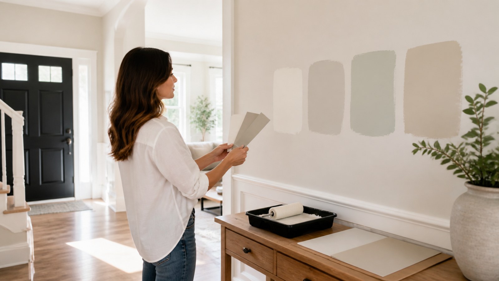
Hold samples beside those fixed finishes before choosing. A neutral that looks clean on a card can turn pink near beige tile, blue beside warm wood, or dirty next to crisp white cabinets. Paint adds value when it makes permanent finishes look deliberate instead of dated.
Warm Whites Are Usually Safer Than Harsh Whites
White can make a house feel clean, but harsh white can make older finishes look yellow, gray, or worn out. Warm whites and soft off-whites often work better for resale because they brighten rooms without making every imperfection feel exposed.
Use white carefully in homes with low light. A bright white room without enough daylight can look flat and cold. If the house has warm floors, cream tile, beige counters, or traditional trim, a softer white may feel more expensive than a stark one.
Greige and Taupe Still Work When Chosen Carefully
Soft greige, light taupe, and warm gray-beige colors can create broad appeal because they sit between cool and warm. They work well in living rooms, hallways, bedrooms, and open areas where the paint needs to connect several finishes.
The danger is choosing a muddy beige or a cold gray that makes the room feel tired. Test neutrals in the actual space and look for one that stays clean in shadows. A resale neutral should feel calm, not dull.
Muted Color Can Add Value in the Right Places
Neutral does not mean colorless. A muted sage, quiet blue, soft green-gray, or gentle mushroom can help a bedroom, office, laundry room, or powder room feel finished. These colors work best when they are calm enough for many buyers to accept.
Use stronger color where it supports the room rather than dominates it. A front door, powder room, built-in, island, or small office can handle more personality than the main living area. The key is restraint: color should feel like a design choice, not a project the buyer inherits.
Refresh Trim Before Judging the Walls
Dingy trim can make even a good wall color look tired. Baseboards, door casing, window trim, interior doors, stair parts, and built-ins collect scuffs and yellowing. Refreshing them can make the whole house feel better maintained.
For resale, trim should usually feel consistent from room to room. A clean warm white, soft white, or other coordinated trim color helps connect spaces. Use a durable satin or semi-gloss trim product so the surfaces look crisp and can be cleaned.
Ceilings Can Quietly Hurt Value
Ceiling stains, yellowed paint, old water marks, and dingy corners are easy to overlook when choosing wall colors. Buyers notice them because they suggest leaks, age, or poor maintenance. A fresh ceiling can make the room feel taller and cleaner.
Use stain-blocking primer where needed before repainting. Do not simply cover a water stain without knowing whether the source is fixed. For listing or appraisal prep, a clean ceiling often improves the impression of the room more than a dramatic wall color would.
Main Living Areas Need Flow
Open living areas, entries, halls, kitchens, and dining spaces should feel connected. If each room has a separate strong color, the house can feel smaller and more chopped up. A consistent main neutral helps buyers understand the layout and makes listing photos feel calmer.
This does not require one exact color everywhere. Adjacent rooms can shift slightly lighter, darker, warmer, or cooler as long as the undertones agree. The main goal is that sightlines feel intentional when someone stands at the entry or looks from the kitchen into the living room.
Kitchens Should Flatter Cabinets and Counters
Kitchen paint has to work with cabinets, countertops, backsplash, floors, hardware, and appliances. A color that fights those fixed finishes can make the kitchen look dated even if the paint is new. Warm whites, soft greiges, muted greens, and gentle taupes often work because they bridge multiple materials.
Avoid choosing a wall color in isolation. Test it beside the cabinet door, counter edge, backsplash, and floor. If the kitchen already has strong undertones, the wall color should calm them down rather than introduce another competing note.
Bathrooms Need Cleanliness First
Bathroom colors should make the room feel clean, dry, and maintained. Soft white, warm off-white, pale greige, muted blue, or quiet green can all work depending on tile and light. The wrong color can make old tile look dingy or make a small bathroom feel dim.
Fix mildew, peeling paint, failed caulk, and ceiling stains before choosing color. Buyers react strongly to bathrooms that look neglected. A simple, clean paint plan with fresh trim and good caulk can do more for perceived value than a trendy shade.
Bedrooms Should Feel Easy to Personalize
Bedroom paint should let buyers imagine their own bedding, furniture, and art. Soft neutrals, warm whites, muted greens, and pale blues tend to work well because they feel calm without being overly specific. Very strong bedroom colors can make the room feel smaller or more personal to the seller.
If repainting several bedrooms, use a related palette. The rooms do not need to match exactly, but they should feel like part of the same house. Consistency suggests care and makes the property feel less pieced together.
Use Dark Colors Strategically
Dark colors can add perceived value when they are used in the right place. A charcoal front door, deep green built-in, navy vanity, or moody powder room can look intentional and memorable. Dark color fails when it covers large spaces buyers expect to repaint immediately.
If using a dark color for resale, make sure the finish is clean, the edges are sharp, and the surrounding colors support it. A dark accent should look designed, not like a leftover experiment.
Sheen Affects the Impression of Care
Resale paint should look fresh but not shiny in the wrong places. Matte or eggshell can work in living areas and bedrooms. Satin is useful for halls, kitchens, baths, laundry rooms, and busy spaces. Semi-gloss or satin enamel belongs on trim and doors.
Too much sheen on damaged drywall can make a room look cheap because every patch reflects light. Too little durability in a busy area can leave walls looking marked before showings are done. Match sheen to both the room and the wall condition.
Listing Photos Change the Decision
Paint colors often look different in listing photos than they do in person. Strong colors can dominate images, dark rooms can look smaller, and cold grays can look harsh under camera lighting. Softer neutrals usually photograph better because they keep attention on space, light, and condition.
Before painting for sale, look at the rooms through a phone camera from the angles likely to be photographed. If a wall color overwhelms the room in a quick photo, it may distract buyers online before they ever visit.
Document Colors for the Buyer
Keeping paint records adds a small but real sense of care. Save the brand, product line, sheen, color name, formula, and room for each finish. Leave touchup paint clearly labeled if appropriate.
This helps the next owner maintain the home and makes the paint work feel less like a quick cover-up. Good documentation is especially useful for trim, ceilings, main wall color, cabinets, and exterior touchups.
Exterior Color Still Shapes First Impressions
Interior paint gets a lot of attention, but exterior color is part of value too. A front door, shutters, porch ceiling, trim, garage door, and siding touchups all affect curb appeal. Buyers start judging maintenance before they step inside.
For resale, exterior colors should work with the roof, brick, stone, landscaping, and neighboring homes. A fresh front door can add personality without repainting the entire exterior. Peeling trim, faded shutters, and mismatched touchups should be addressed before adding a bold new accent.
Rental and Refinance Goals Are Different
A rental refresh should prioritize durability, easy touchups, and broad tenant appeal. A refinance refresh may focus more on visible maintenance and clean condition. A listing refresh needs to photograph well and reduce buyer objections. The best paint color depends on the reason for the work.
For rentals, use repeatable colors and keep records so maintenance is simple. For resale, spend extra attention on entries, kitchens, baths, living areas, and trim. For appraisal or refinance preparation, fix stains, peeling paint, and obvious damage that suggest deferred maintenance.
Know When Not to Repaint Everything
Sometimes the best value move is not repainting every surface. If a room already has a clean neutral color that works with the finishes, touching up trim or repairing scuffs may be enough. Repainting everything can waste money if the new color is only marginally better.
Prioritize the areas that change perception: entry, main living spaces, kitchen, bathrooms, primary bedroom, hallways, doors, and trim. Leave clean secondary spaces alone when they already support the overall palette. A targeted paint plan often gives better return than a rushed whole-house repaint.
When budget is tight, paint the surfaces buyers notice first from standing height: doorways, corners, baseboards, stair walls, kitchen edges, bathroom ceilings, and the entry path. These areas quietly tell buyers whether the home has been handled gently.
Paint Should Reveal Maintenance, Not Hide Problems
Fresh paint can raise confidence, but it can also make buyers suspicious if it appears to cover leaks, cracks, or damage. Stains should be investigated and primed properly. Cracks should be repaired honestly. Peeling areas should be scraped and stabilized before finish paint goes on.
Value-friendly painting is transparent in the best way: the house looks cared for because the surfaces actually were prepared. Paint that hides unresolved problems can backfire during inspection or negotiation.
Final Resale Paint Color Review
Paint colors that increase home value usually make the house feel clean, current, and easy to move into. Choose warm whites, soft greiges, gentle taupes, muted neutrals, and restrained color where it supports the room. Refresh trim and ceilings, test against fixed finishes, and keep main living areas visually connected.
The best resale palette does not erase personality completely; it removes distractions. When paint makes the home look cared for, photographs well, and helps buyers imagine their own life in the space, it supports value far better than a trendy color chosen in isolation.